Decided : UI/UX Design, Mobile
Decided helps busy and indecisive people choose where to eat by randomly generating a restaurant based off of users’ preferences.
Role : Solo UX Designer for Google UX Design Certificate
Tools Used : Figma
Duration : 2 Months
Purpose
“I’m hungry!” “Where should we eat?”
30 minutes pass by, and you're still trying to decide where to go for dinner. You don't know if you should stick to the same restaurants you've been going to every week or try something new. Those with a busy schedule can’t afford to spend a lot of time trying to decide where to eat, and those that are really indecisive are pulling their hair out looking through every restaurant and menu until they come across something they like. Everyone has pondered over this question before and have spent a large amount of their time trying answer it but are often left disappointed.
As a result, the purpose of my app is to help those that are busy or indecisive. The app will randomly generate a restaurant based off of users’ preferences, saving time, catering to needs, and allowing users to try new foods in their area!
The Problem
Whether you’re looking for a quick bite or an anniversary dinner, it’s easy to get lost on a 30-minute-long deep dive on Yelp trying to decide on a restaurant. With the vast amount of choices, it’s hard to settle on just one.
This leads to the problem:
How might we make deciding on a restaurant easier and more efficient while also taking into consideration the different criteria people have?
Research & Interviews
Through research, I found that people have a difficult time deciding where to eat (especially in group settings) due to everyone’s different preferences. Some people are extra picky eaters while others have allergies/dietary restrictions, which makes it difficult to decide on a cuisine everyone likes and is able to eat. Another ground for indecisiveness is due to choice overload. Choice overload is when there's too many options and a consensus cannot be reached out of fear of making the wrong decision. Distance travelled, price range, dietary restrictions, and type of cuisines play a huge role in deciding where to eat, and when all the boxes aren’t checked, it takes longer to decide.
I conducted 5 interviews and created empathy maps to further understand users and their needs. My target user group is college students/young working adults that have packed schedules or are indecisive when it comes to deciding where to eat.
Key Insights :
People typically eat out 2-4 times a week and it sometimes can take 30 minutes to an hour for people to decide on a place to eat.
People consider budget, location/conveniency, reviews, and dietary restrictions when deciding on a place to eat.
Hunger affects our emotions. Not having something in our system can lead to frustration.
Choice overload - brain is faced with overwhelming amount of options and therefore struggles to make a decision or the worry of making the wrong decision may play a factor in indecisiveness
User Persona
User Pain Points
1. Time
Looking through multiple restaurant Yelp reviews and reading through their menus to decide on a restaurant takes longer than working adults/busy college students would like.
2. Inclusivity
Platforms for finding restaurants don’t always include dietary restrictions.
3. Accessibility
Platforms for finding restaurants may be overwhelming (choice overload) and not as easy to navigate.
Design Process
Paper & Low Fidelity Prototype
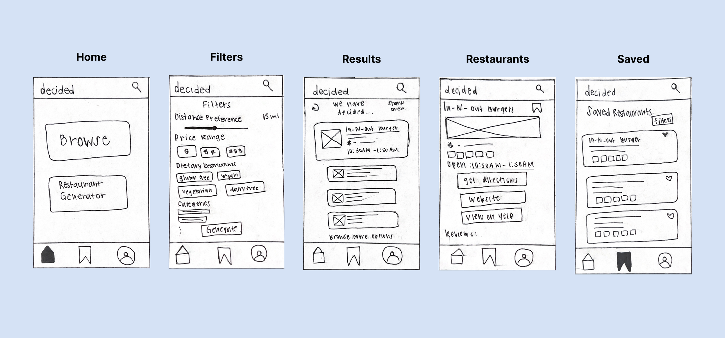
I created multiple paper wireframe iterations, and I eventually landed on this iteration that would address user pain points. I prioritized a quick and easy survey process that would generate restaurants based off the choices they made.
Usability Study Findings : Round 1
After I created a low fidelity prototype based off the paper prototype, I used it to conduct usability testings. These are some of my usability findings after the first round of testing.
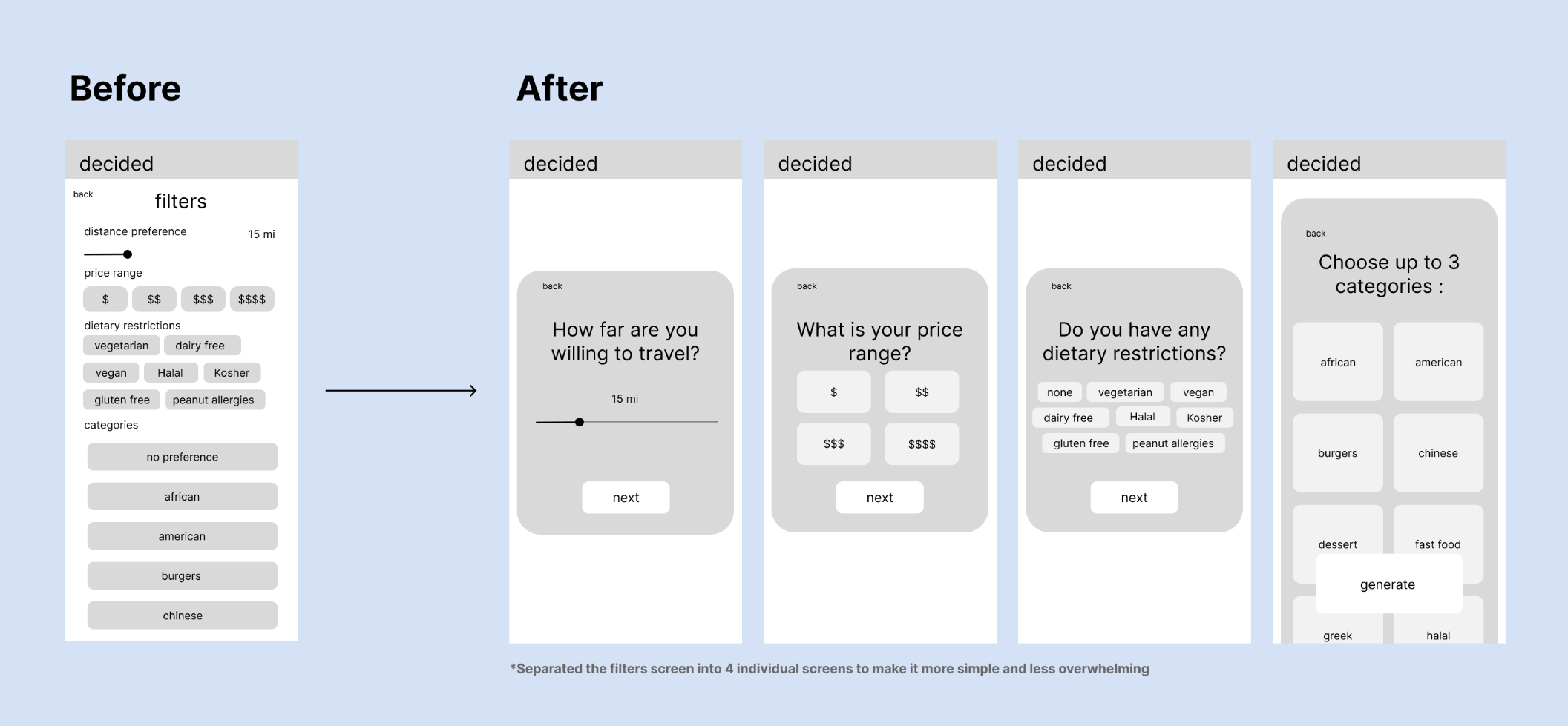
1. Separate survey questions into individual screen because it was overwhelming/very crowded for users.
2. Users want to see past restaurants they’ve explored and also restaurants they've generated (history page)
3. Be able to regenerate/refresh new restaurants if they dislike the options shown without having to start the survey over again.
Filters Page
Results + History Page
Usability Study Findings : Round 2
After a second round of usability testing with the new mockup, I found that :
1. Users want a filter that could sort saved restaurants.
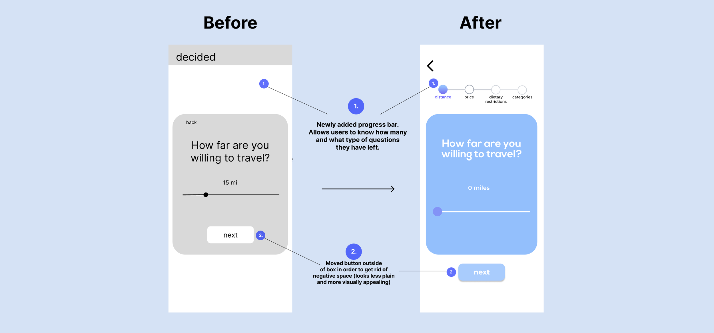
2. Add a progress bar.
3. Include bookmark icon in history page so people can save restaurants.
Filters Page : Progress Bar
Saved Page : Filters Function
High Fidelity/Final Prototype
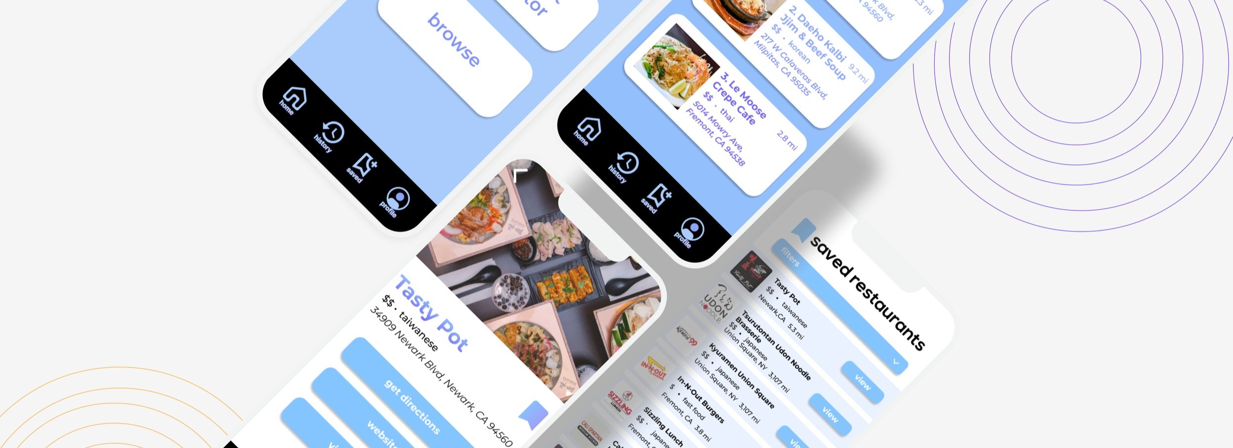
The final high fidelity prototype presented cleaner user flows for generating restaurants. It also met users needs for having a sorting option under ‘Saved Restaurants’ and also adding a ‘History Page’.
Accessibility Considerations
1. Used icons and descriptions to help make navigation easier.
2. Larger texts and labeled buttons - caters to those with bad eyesight while also keeping navigation simple.
3. Included images and minimal texts to keep it simple for users to read and understand the design and navigation process.
Takeaways ~ What I Learned
One of the main things I learned through my first project was that my first design will not be my final design. I didn’t realize how many iterations and changes I would make after each usability study or how many details/functions I missed or didn't add to my app. Usability studies were helpful and important in improving my designs, as I realize that I’m not my user group. Other people will see things that I may not see, so I can’t be biased toward my own design.
Next Steps
I want to conduct another round of user testing to make sure all pain points were addressed and iterate on my prototype. I also want to do more user research to make the app more inclusive! I think it would be fun to see how my app could improve even more and what other functions would be helpful and creative for users!


