Movement : UI/UX Web Design
Movement is a networking platform for dancers to stay connected with friends and instructors while also being able to showcase their work to others and find workshops near by!
Role : Solo UX Designer for Google UX Design Certificate
Tools Used : Figma
Duration : 2 Months
The Problem
Dancers don’t have a platform to network/connect with others dancers and surround themselves with like-minded people who have similar career goals. This leads to the problem :
How can we create a platform for dancers to network with one another and find a community? How can we make this platform helpful to those new to the dance community?
The Solution
Movement is a platform for dancers to not only network but to also express themselves. Through Movement, new and old dancers can post their own dance journeys and experiences while also following other people’s journeys. They can join communities and look for events nearby that cater to their interests. Movement will help dancers to grow in their dance careers.
Research & Interviews
I interviewed a wide variety of people that ranged from beginner dancers with no experience to intermediate/advanced dancers that have been in the dance community for a while. These interviews were really insightful in understanding what people would be looking for in a networking platform for dancers. Here are some of my key insights I found from my interviews and research :
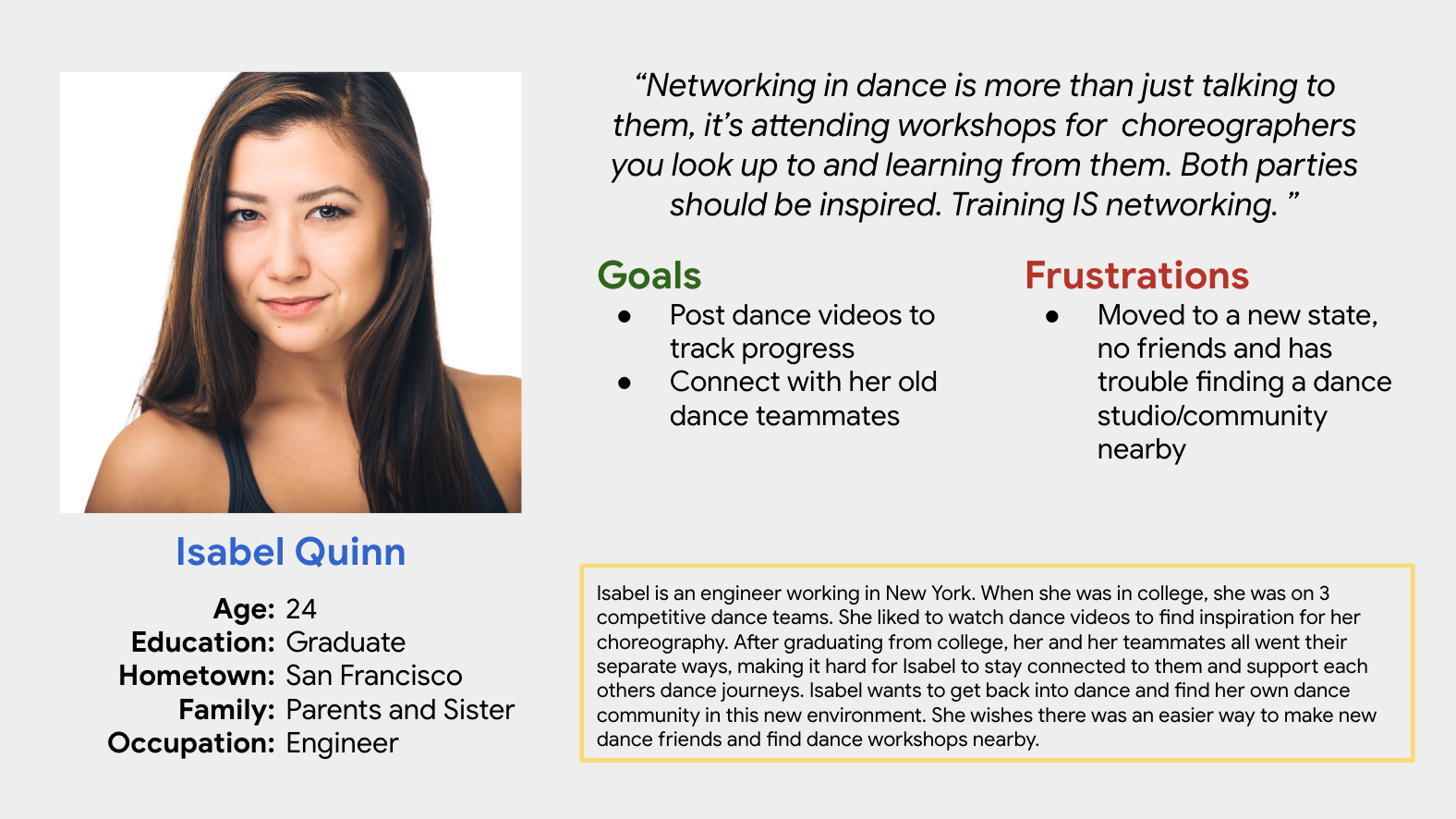
Networking isn’t just reading someone’s dance experience and thinking they’re a nice person, it’s about being inspired by their work and attending their dance workshops to learn from them.
People like watching dance videos because they enjoy watching how different people may interpret music. It gives a different perspective of dance that people may not have seen before. A big part of dance is finding inspiration in other people's movements and seeing how they interpret different rhythms and beats as well as seeing an entire choreography come together.
People post dance videos to track their dance progress. They want to see how much they have improved over time while also being able to support their friends' progress too.
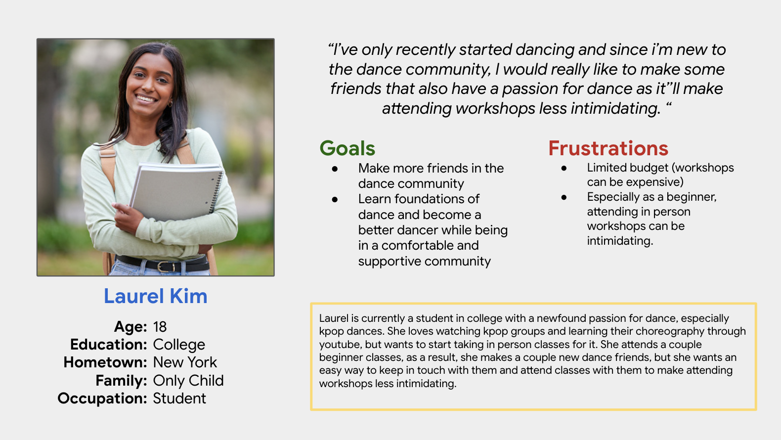
Some beginners have a difficult time attending dance workshops because it can be scary/intimidating to go alone. Having a safe space for beginners to learn a bit about dance and make friends before taking a workshop is preferred.
User Personas
Design Process
Paper & Low Fidelity Prototype
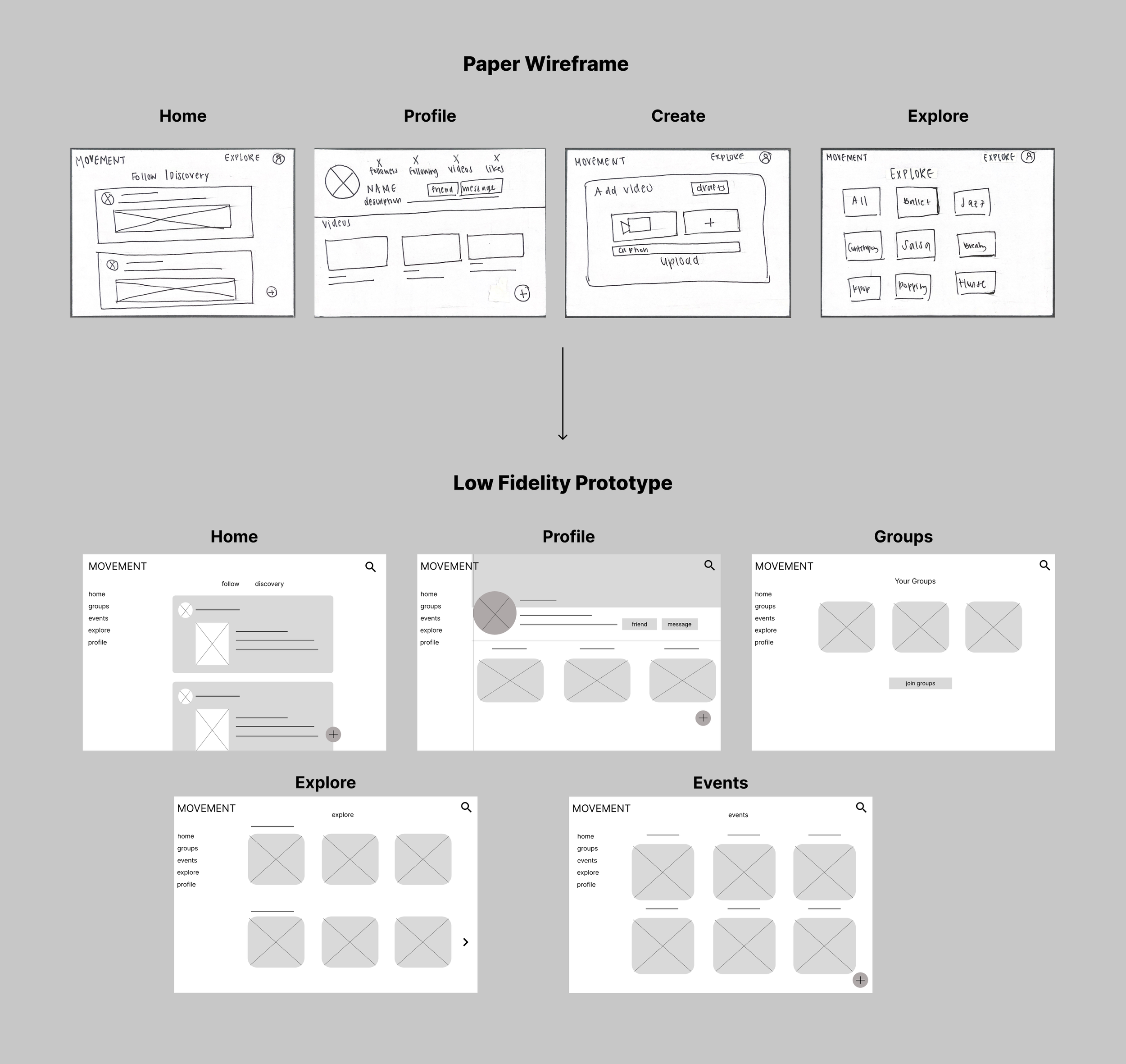
I brainstormed a couple paper wireframes and eventually landed on this one, but while creating the low fidelity prototype, I thought of a couple more functions and included them in the prototype :
1. I added a navigation bar on the left to make it easier to navigate each page.
2. I also added an extra ‘Events’ page along with the ‘Explore’ page since there are a lot of workshops and dance events that might not necessarily be categorized under ‘Explore’.
Usability Study Findings : Round 1
After conducting multiple usability tests, here are some of my findings :
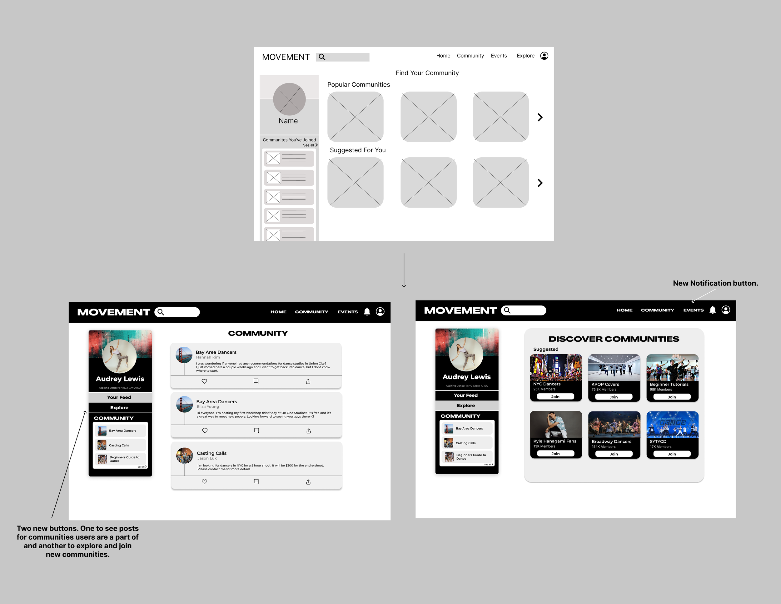
1. Added a ‘Community’ page. Users want to join communities to be able to connect over shared interests in dance and meet new people.
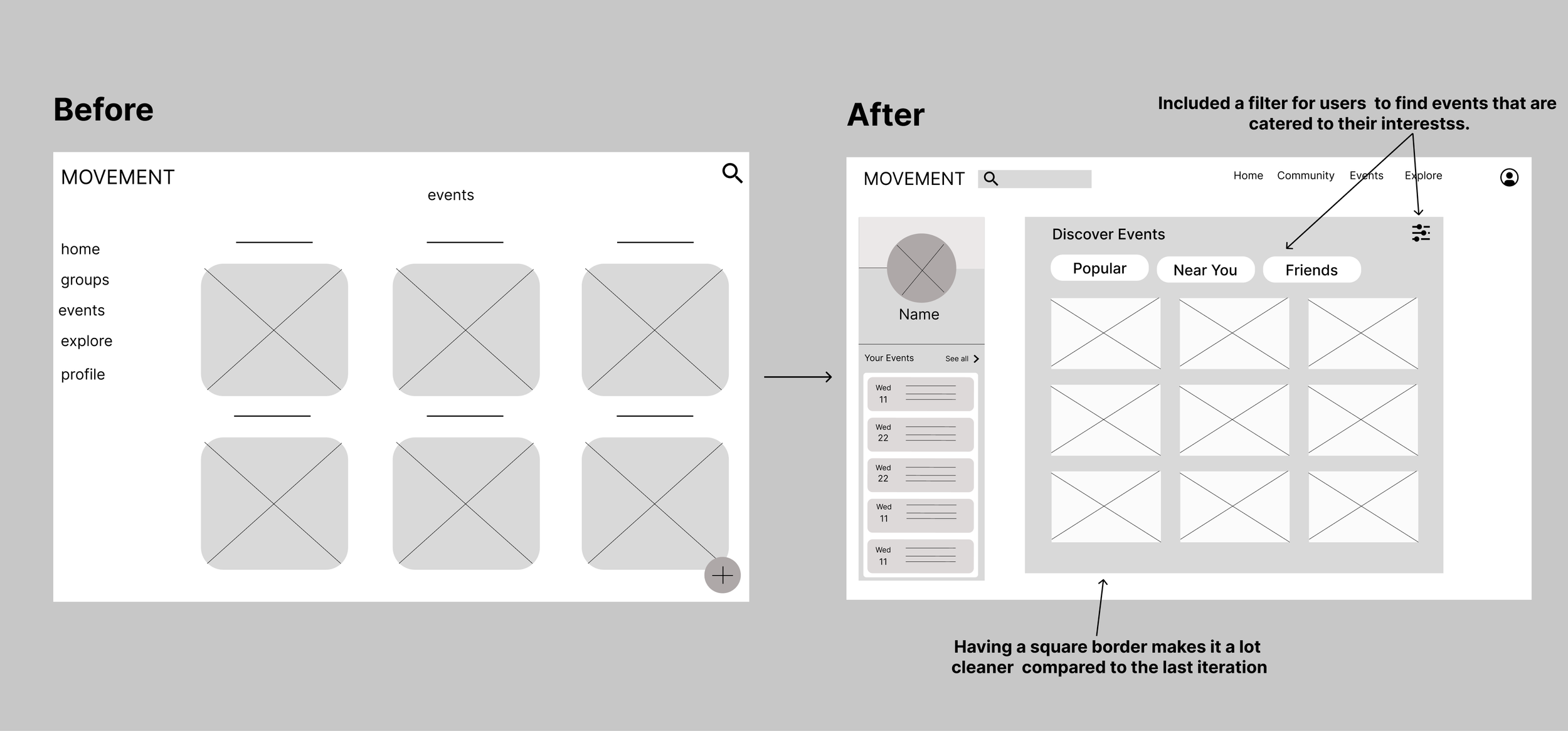
2. Moved the navigation bar from left to the top and added a profile section on the left instead. It’s a lot cleaner, and users can find communities and events information easily.
3. Change layout for the ‘Events’ page because it’s harder to separate by categories, so it’s more impactful to have a filter/sorting system (they can also search to find more specific things).
Home Page
Events Page
Usability Study Findings : Round 2
1. Included a separate feed for updates and posts from communities users are a part of. It won’t get mixed with the main feed and users can see information just for those communities.
2. The ‘Community’, ‘Event’ and ‘Explore’ pages seemed redundant, so I got rid of the ‘Explore’ page since some information overlapped with ‘Community’ and ‘Events’, and I couldn't categorize it efficiently/make it organized.
3. Added a notification button. People want to be notified about upcoming events and posts from the communities they are in.
Community Page
Reflection
Takeaways
Even though I’ve used a lot of websites before, I realized that it’s a lot harder to design one from scratch. There are tons of design layouts, and it’s important to listen to users to see which one is the most user-friendly and efficient to use. Listening to user feedback helped improve my website and brainstorm new functions that I never would’ve thought of if I didn’t do a usability testing.
Next Steps
I definitely want to conduct more user testing to create a better design layout. Some pages still seem empty, and I want to fill the empty spaces. Additionally, I want to create more functions to help dancers connect with more people and find their own community.
High Fidelity/Final Prototype
